Palram
Case studyScroll ↓
- Client
- Palram
- Scope
- RebrandColour systemIcon systemWebsiteExhibition and signage
I led the rebrand, creating one clear and consistent brand language that connects both B2B and B2C.
Palram is a global manufacturer of thermoplastic sheets and panel systems. The new language makes the brand feel unified, premium and easy to recognize across all markets and touchpoints.
The Palram logo
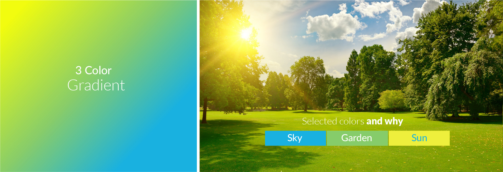
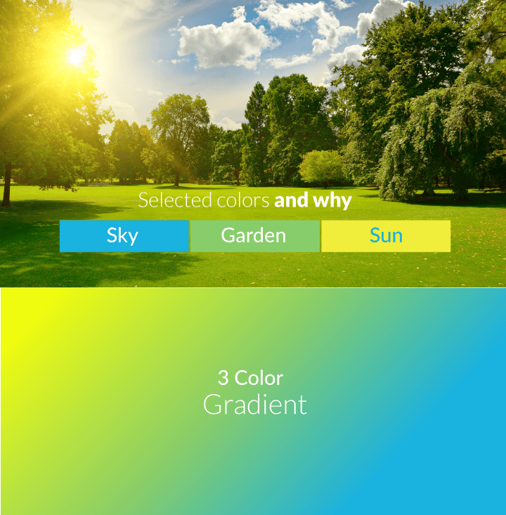
Colour system: Sky, Garden and Sun
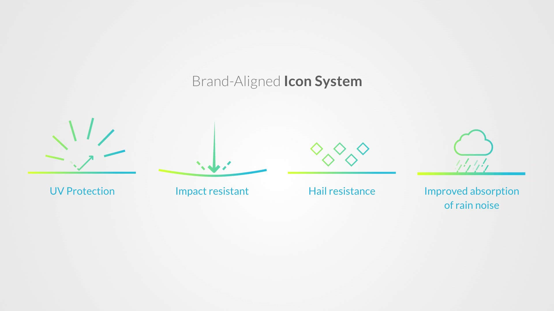
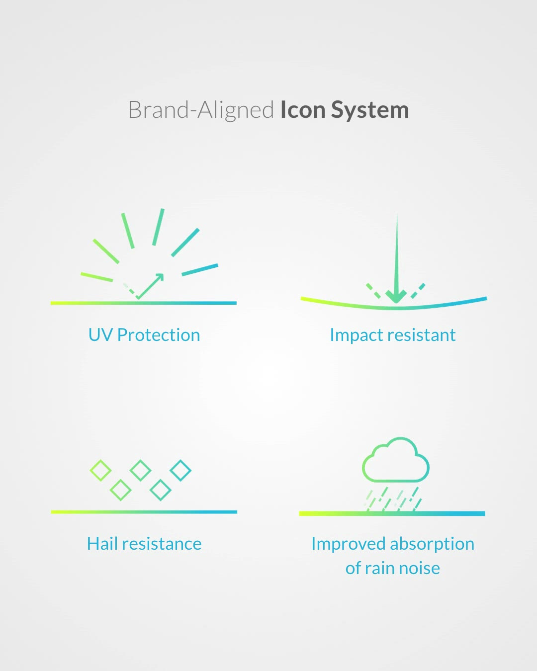
Brand-aligned icon system
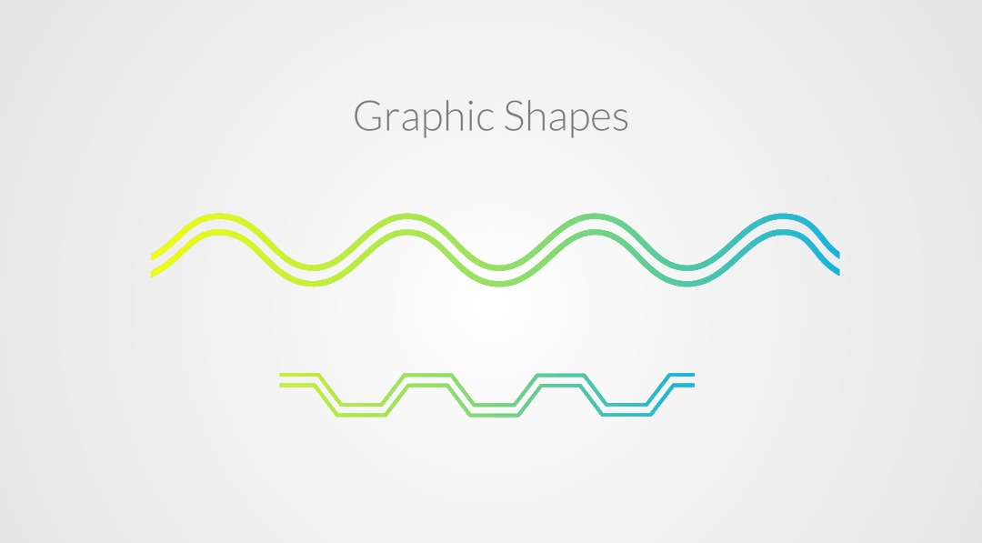
Graphic shapes
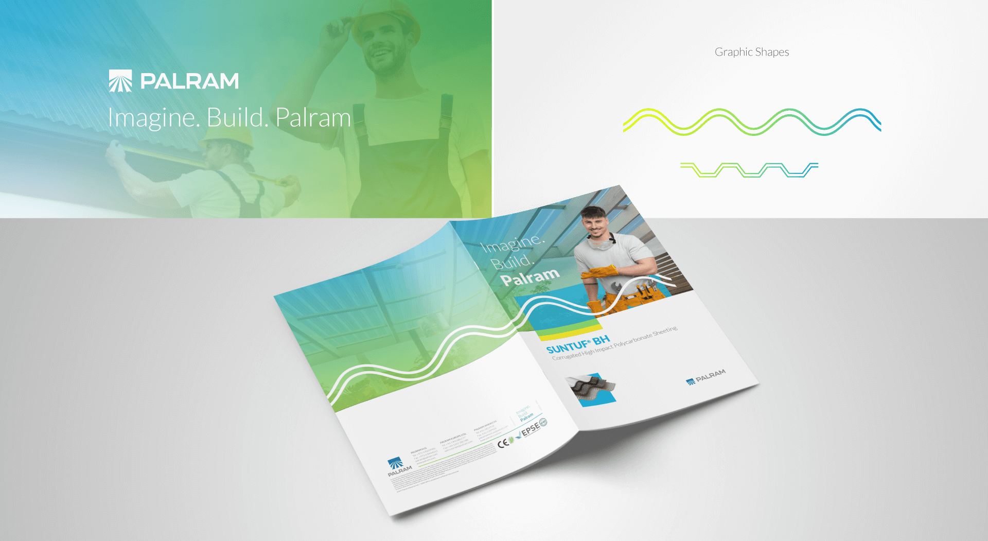
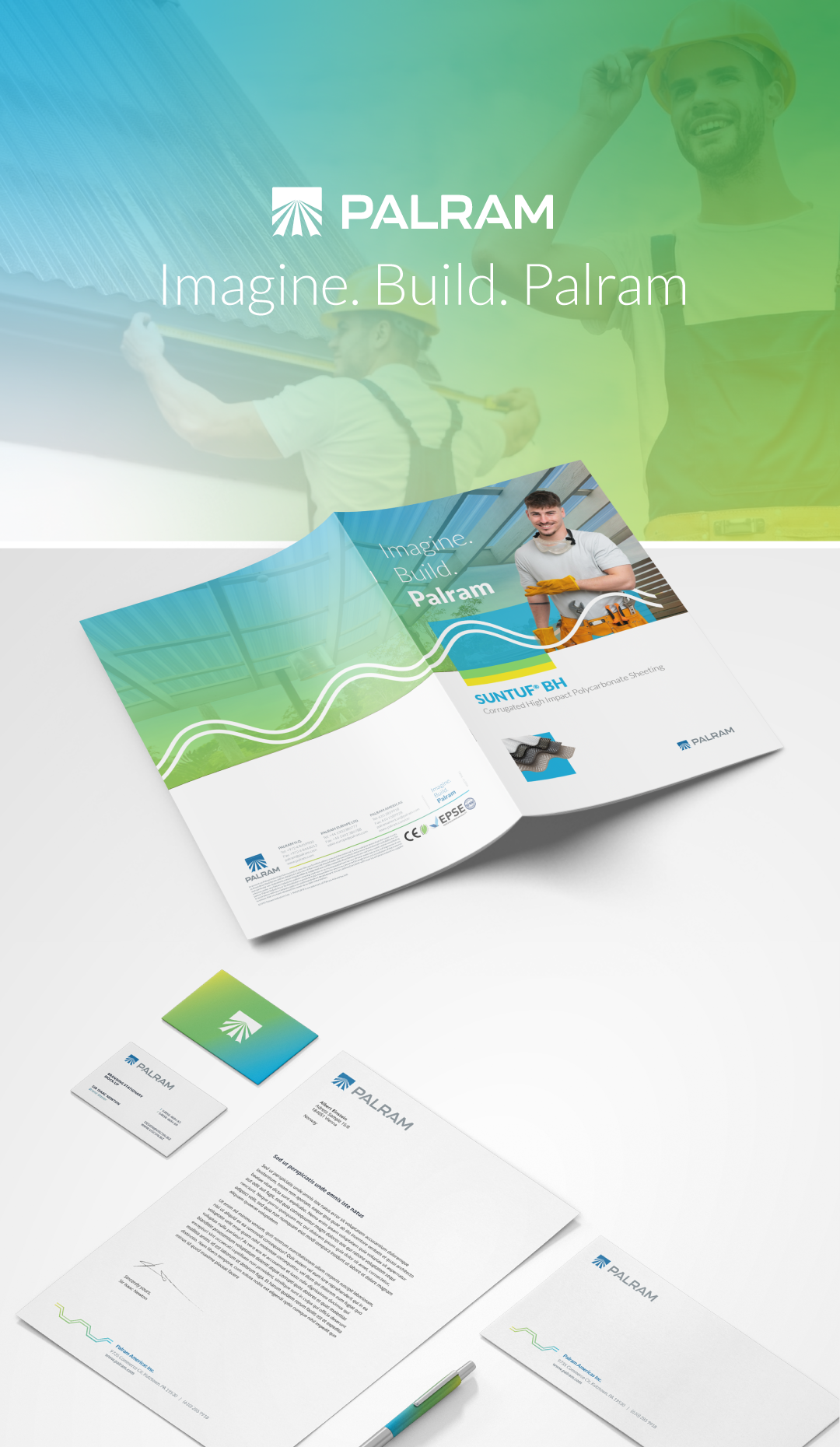
Brand language
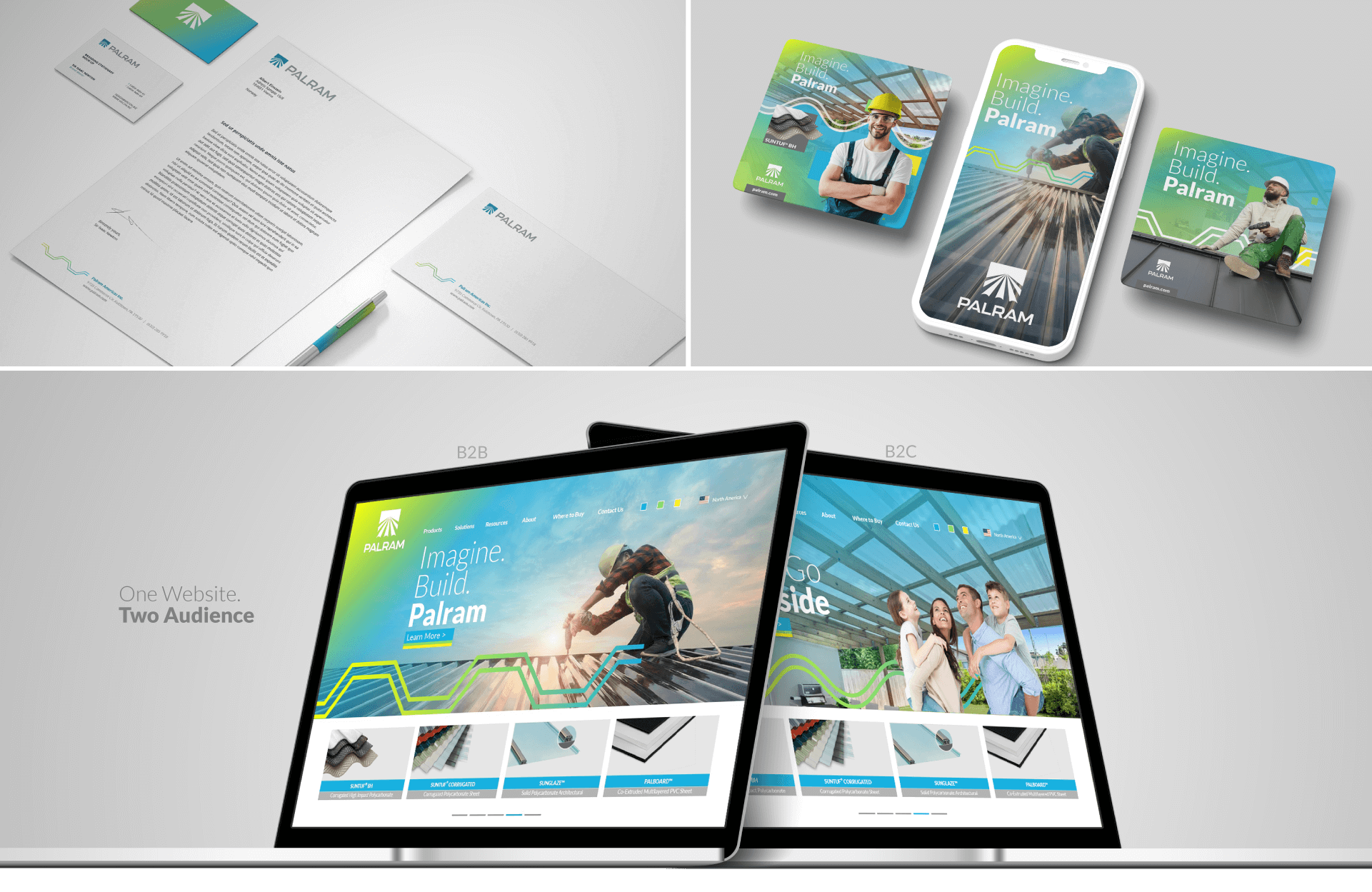
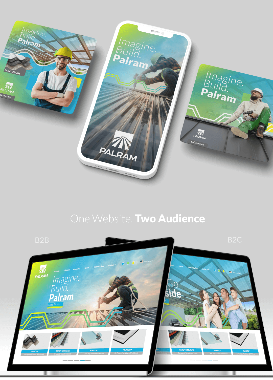
One website, two audiences
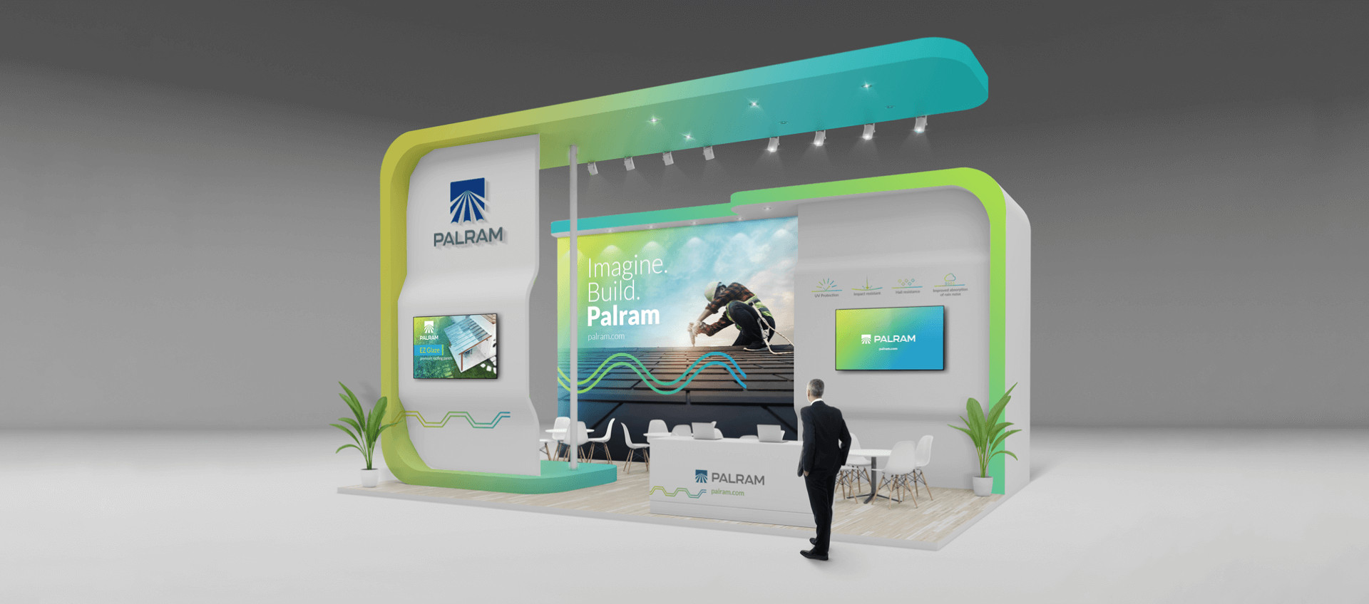
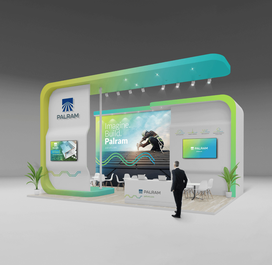
Exhibition and environmental graphics
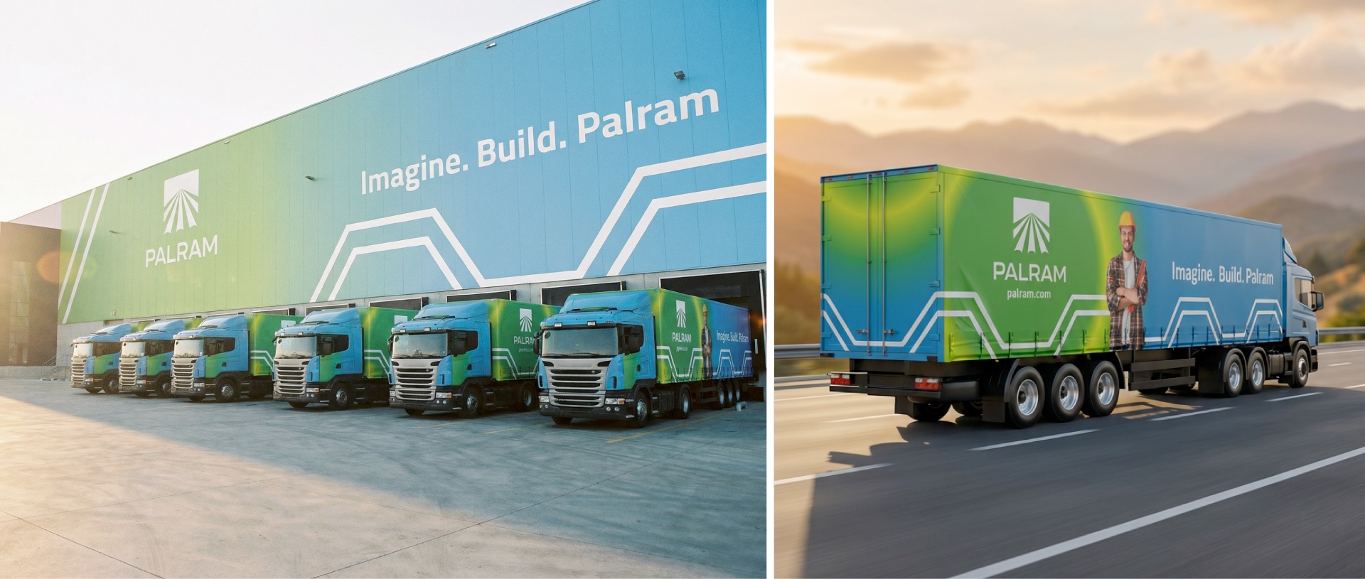
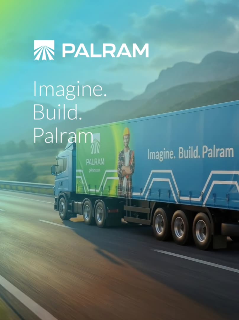
Fleet and signage
More work
 pHi-TechBrand & motion
 Polyram GroupCorporate
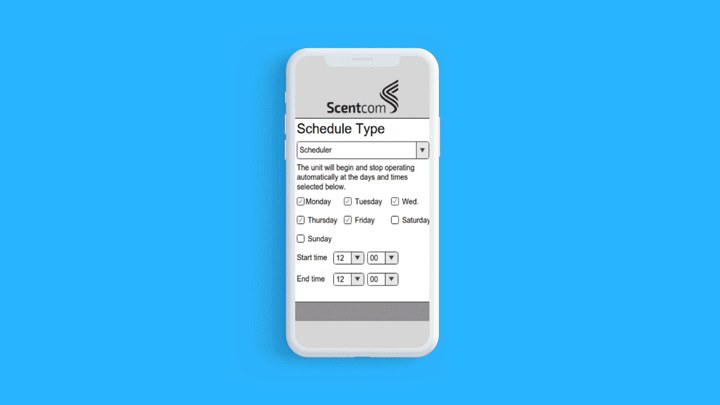 ScentcomDigital product
 MetroboardBrand identity
 GoMixAppDigital product
 Mer GroupCorporate
 NextcomDigital design
 Right CupBrand identity
 MisgavWebsite rebrand
 OptimaiDigital product
 Sivan GroupWebsite design
 Canada IsraelCampaign
 EzraCreative direction
 IPCEducation
 MerbaCampaign
 Casino TripBrand portal
 GetfitDigital product
 ELENITO GROUPCorporate
 PCBBrand system
 AravaBrand language
 TorrVisual identity